I’ve spent the morning finishing off The Opium Den and have posted it (you can click through for a better quality and high res shot) on my gallery site. Because I ended up glazing it a few layers deep with a series of red, yellow, and brown polymer layers, it’s quite subdued and both very dark and very glossy, so I had to take this photo in quite dim lighting and a four second exposure. While I still think it’s a pretty good project, I’m least happy with this of my latest works, so if you want to make me an offer on this (snowrail@gmail.com) now is the time to low-ball me! I’ll try and re-shoot it though, because it does look better in real life and the colours are definitely off.
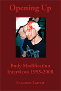
And if you like it, check out my 2009 art calendar (or the 2009 weekly body modification calendar as well)… Both would make great Christmas presents, hint hint!


5 Comments
much better :) that gave it alot more depth and pulled the layers apart a bit.
Thanks. I’ll try and re-photo it — it looks a lot nicer in person.
I personally liked the earlier lighter version. It’s not busy to me, there’s just a lot to look at!
Check back tomorrow — I’ll rephoto it with proper lighting and I think you’ll like it… It’s very hard to get a clear shot of.
https://zentastic.me/blog/2008/11/15/an-aweful-lot-of-big-pictures/
That’s got a photo of it taken with a flash — it’s got a nice glow to it… That said, I like the new one I’m working on more. I think it’s going to be really funny.
One Trackback/Pingback
[...] that it’s quite luminous in the right lighting and perhaps the difference between this and the previous photo show you just how tricky it is to capture. This picture is actually probably closer to the real [...]
Post a Comment