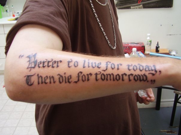
There’s a tattoo artist in the studio building that we live in, over on the other side (incidentally, I think in Saira and Michael’s old studio), and I’ve been meaning to post this “oops” photo from his online portfolio for a while — reminded to do so because I read Lamebook more than Facebook, so this is posted with apologies to anyone waiting for a response there. It will come eventually. Anyway, I just love misspelled and grammatically messed up tattoos… and there are so many to heartily laugh at.


10 Comments
I’ve never understood how people could make such silly mistakes, especially when it comes to something that’s going to be on your body for the rest of your life. Sucks for that person . . . and the ridiculous amounts of other people that do the same thing.
i’m covering up my own grammatical tattoo mistakes right now actually, so i can definitely relate to this post haha.
placement and close up:
https://www.flickr.com/photos/kylemassaar/3222959159/in/set-72157612904868691/
https://www.flickr.com/photos/kylemassaar/2280627072/in/set-72157603952802727/
and coverup, just for curiosity’s sake (three sessions in):
https://www.flickr.com/photos/kylemassaar/4333048666/
i cant see what you enjoy about lamebook, its pretty weak IMO.
sweet torso kyle!
whos the artist?
I LOVE lamebook, and failbooking. Oh man, they’re some of my favorite blogs ever.
The stupidity!!
daniel innes is doing it. i have another sit on it tomorrow morning actually. lurk my flickr for updates if you want!
https://www.danielinnes.com
haha Kyle that’s actually really funny. The cover-up is looking really good!
Longtime lurker…Im not sure how I came to this site –
https://ugliesttattoos.com/
But pretty sure you were the conduit to it one way or another. I thank you!!
My 22 yr old son and I sat for a couple of hours the other night and laughed hysterically at some the the photos on there. Some of them were really sad too. Our version of “quality family time.”
Thanks again…
It never ceases to amaze me!
Well Kyle, look at it this way: The cover up your going to have is a million times sweeter then then the other one!
yeah i definitely like this piece better aesthetically than just the static text i had before! once the colour goes into the tiger is should cover the rest of the text up quite nicely.
Post a Comment