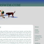
Since the new owner of my old servers decided to pull the plug on all my remaining sites, I figured that instead of just moving them, I’d take the opportunity to redesign them. These are my first two from scratch WordPress themes (this site is based on VeryPlainTxt, one of my favorite themes), along with another theme that’s for a different CMS that I’m fiddling with.
Anyway, this is my rough work for the relaunches of my kitcar site and the winter swimming site. Both put an emphasis on simplicity and clean design. I know some might find them sparse, but I’m not a fan of how busy sites are these days, and I really like seeing just the content and not much else.
Update: Price of His Toys is running.


7 Comments
Well that was rude and a bit low-brow of them. You weren’t exactly using mad amounts of bandwidth…
I agree with you on simplicity on websites being better. I also get exhausted of the busy nightmare that is most sites.
They both look nice. I really like how the winter swim looks. Like really like it. I’m not a fan of the green you used on the kit car site, it seems too green. (or something.) The layout is great though!
Looking at the green now, it does look a bit “green”… I’d meant to do more of a british racing green, so I’ll tweak that a bit.
I cannot remember which famous writer said it best with “Simplicity! Simplicity!” but that definitely works :)
While that phrase might have been referring to a lifestyle, it can be applied to many things (even websites).
(I have been wanting to create/own a website – mainly for blogging and posting my inventions. Considering I dont know diddly squat about the prices of a website/storage/etc – it will have to wait a while.)
BTW- how is your notebook doing? I remember you writing aobut the power supply a bit ago. I hope it’s up to par now:)
Catch ya later
ed
I really like the simplicity of the look. Very clean and organized. And I like the green! Course, I’m a fan of green anyway, so maybe that doesn’t count.
:)
I’m a huge fan of simplicity in websites. Let the content speak for itself. A minimum of design and colour, and for pete’s sake no animation, flash, music or any of the other crap that make myspace pages such horrific train wrecks.
I don’t like too much stuff around, online included, either so I like the look, too.
I’d actually love to try winter swimming. I run all year round but find running (and all other forms of physical activity) most enjoyable in winter time.
i laugh every time i come to your blog and read “yoink”.
Post a Comment